Nectar
Nectar Sleep were a company that had just started out a short time before but was doing quite well, selling good-quality mattresses online.
Sales!
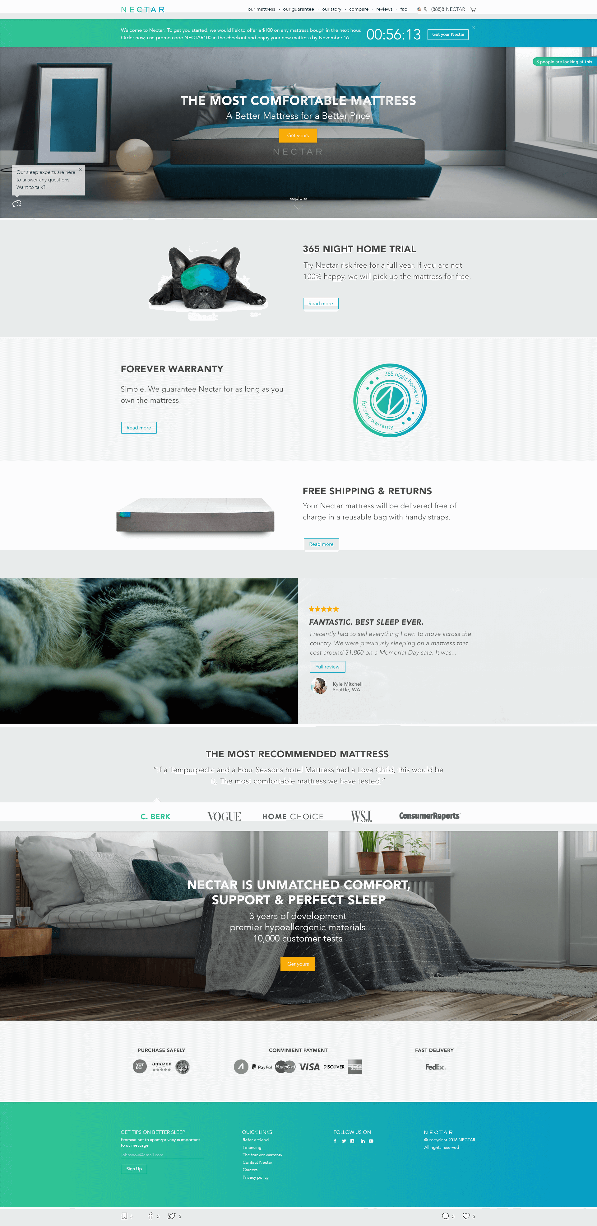
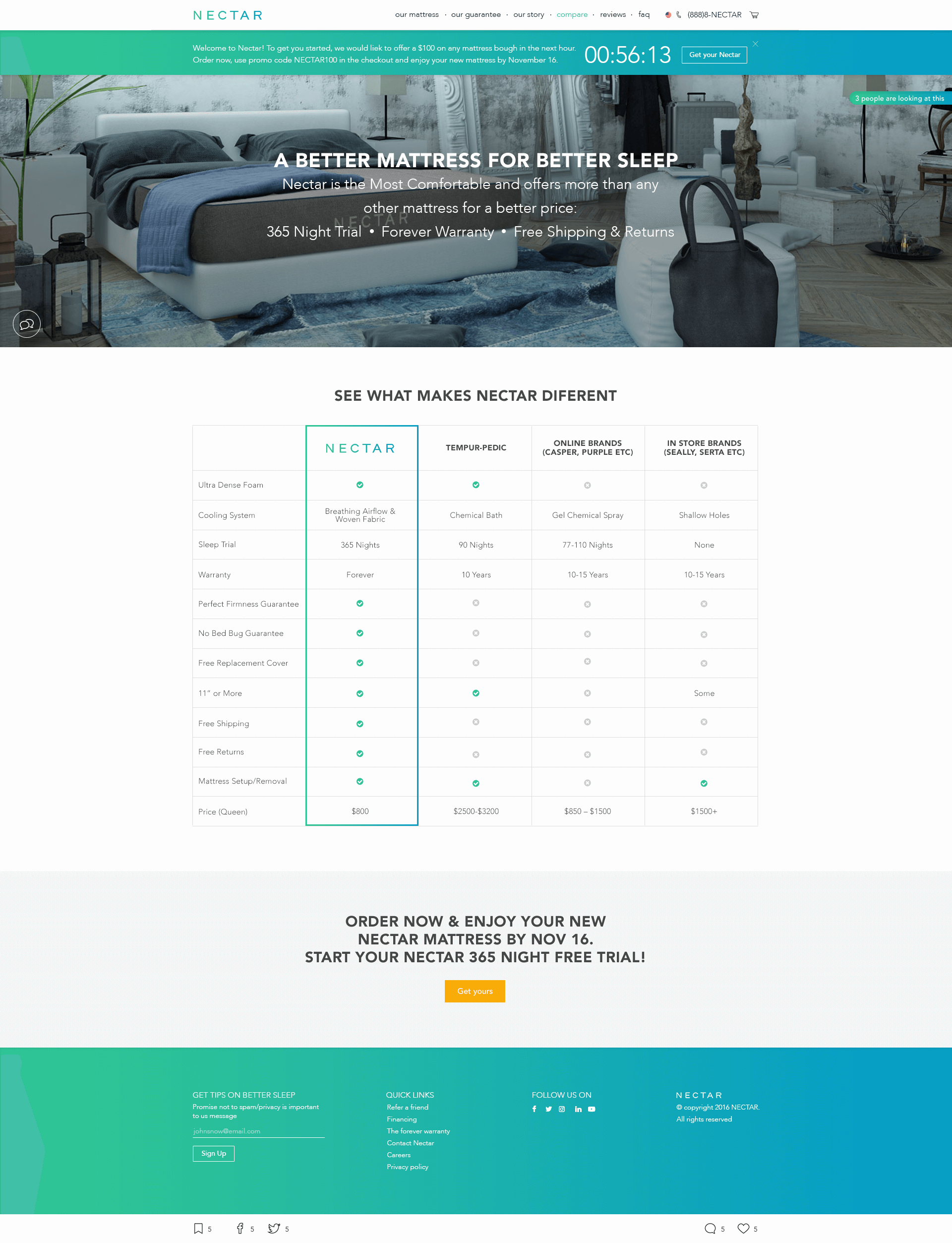
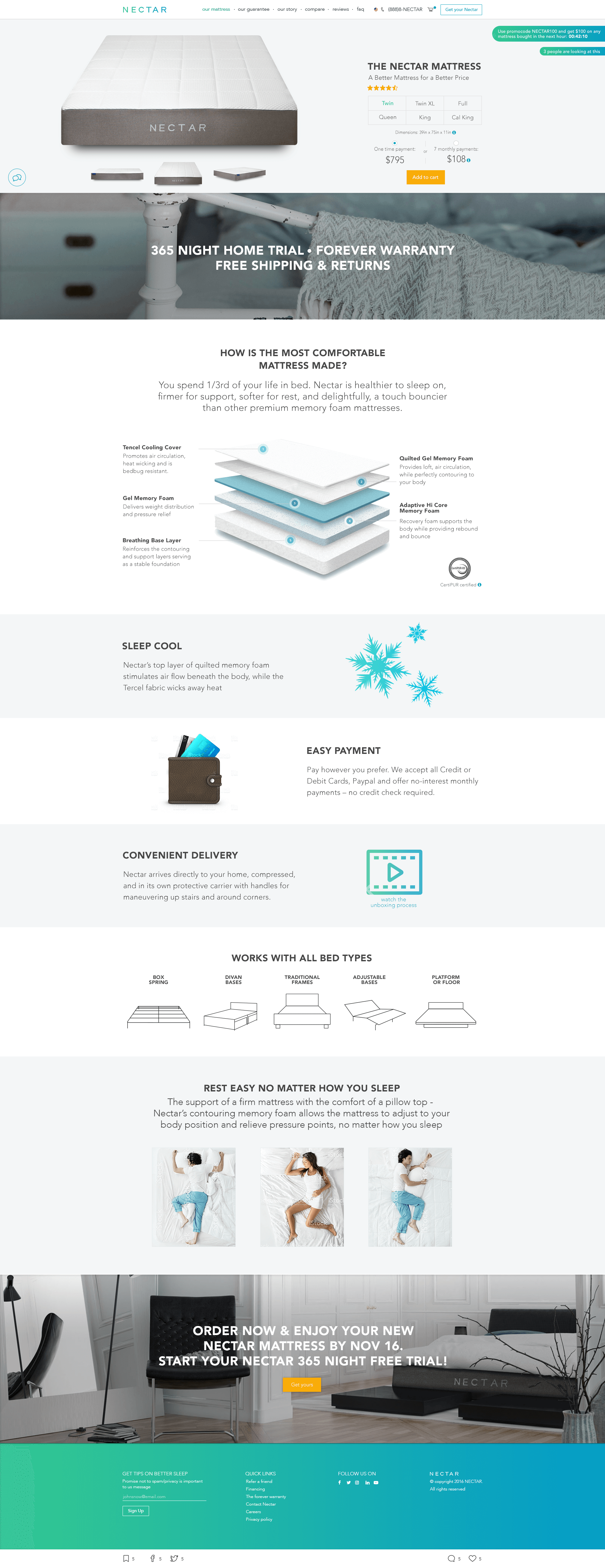
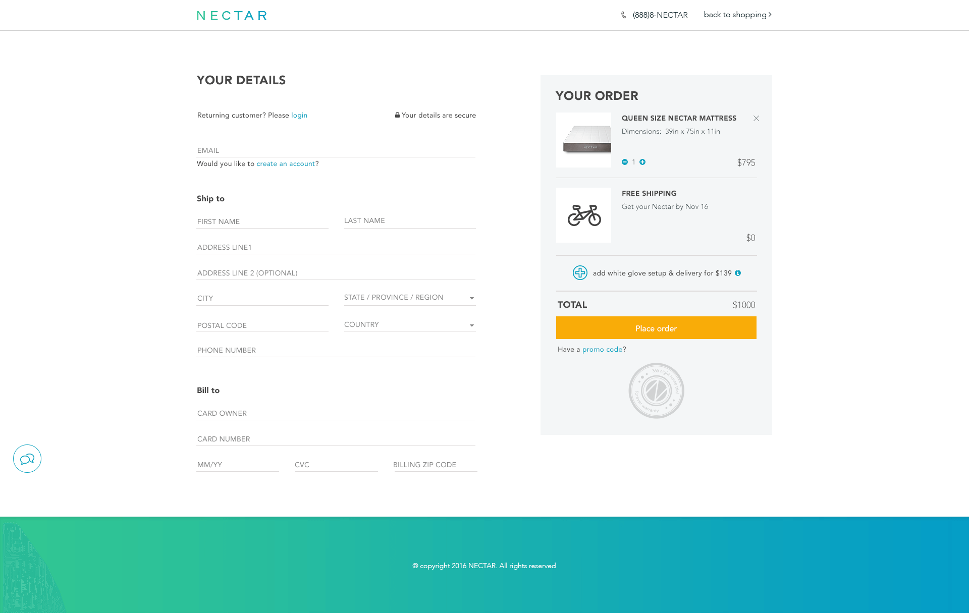
We were hired to redesign Nectar's website to give it a fresh look, improve on the UX and ultimatly drive the sales up.
We focused on few aspects: dead easy purchase process, social proof, engaging the potential buyer with the story behind the brand and making all the relevant information very clear and available. The site is built around 3 advantages Nectar have - a year long home trial, forever warranty and free shipping and returns. The user can conveniently make the purchase from any place on the site and is reassured by user reviews they can relate to, media articles and live notifications about purchases being made. The user can also see for him/herself how easy it is to unbox the mattress (video), how easy it is to return the mattress if they change their mind, how long before the mattress gets delivered and other information to reduce any possible objections - even before they arise.
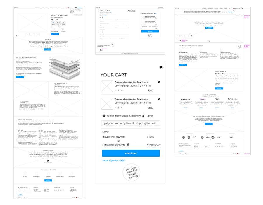
Fresh look
We gave the site a modern, minimalistic but vibrant look. The images are all about comfort and style and we designed some custom icons to enhance the style and message. After the design was ready, we've coded the pages (HTML, SCSS and some JS) to convey to the developers not just a pixel perfect look - but also the feel.