Rider
Rider are an app similar to GetTaxi, with one big difference - they are working together with already existing taxi stations. They've been in the market for about a year, and asked us to redesign their app shortly before launching their second version.
The challenge
With one month until launch, we've been asked to come up with a better UX and a fresh look for both the driver and passenger apps (iOS + Android, English and Hebrew) and also adding few new features, all the while keeping in mind the development schedule.
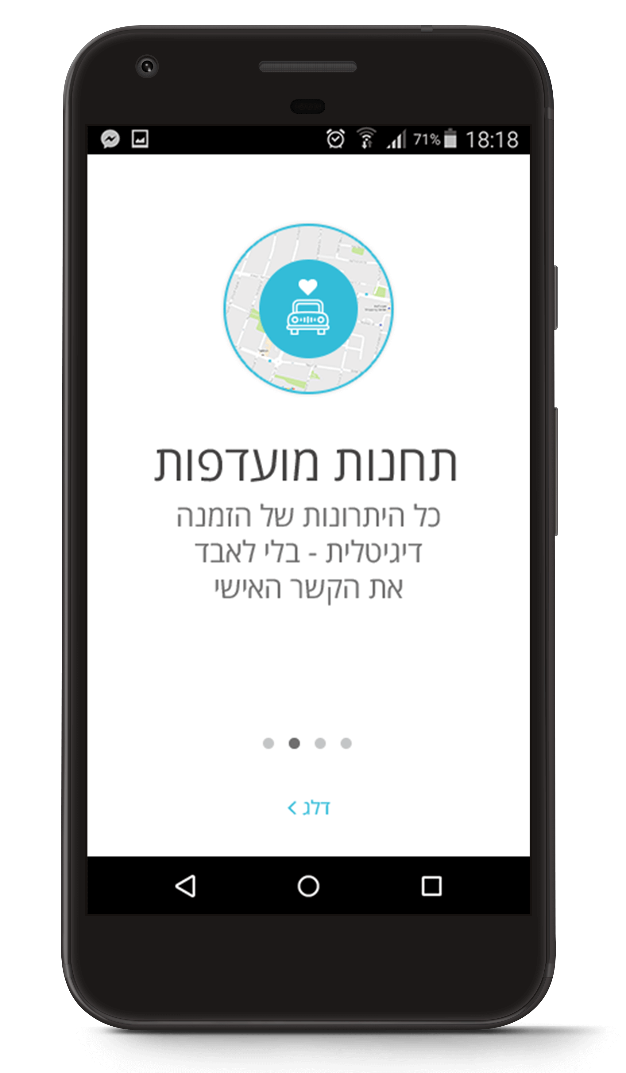
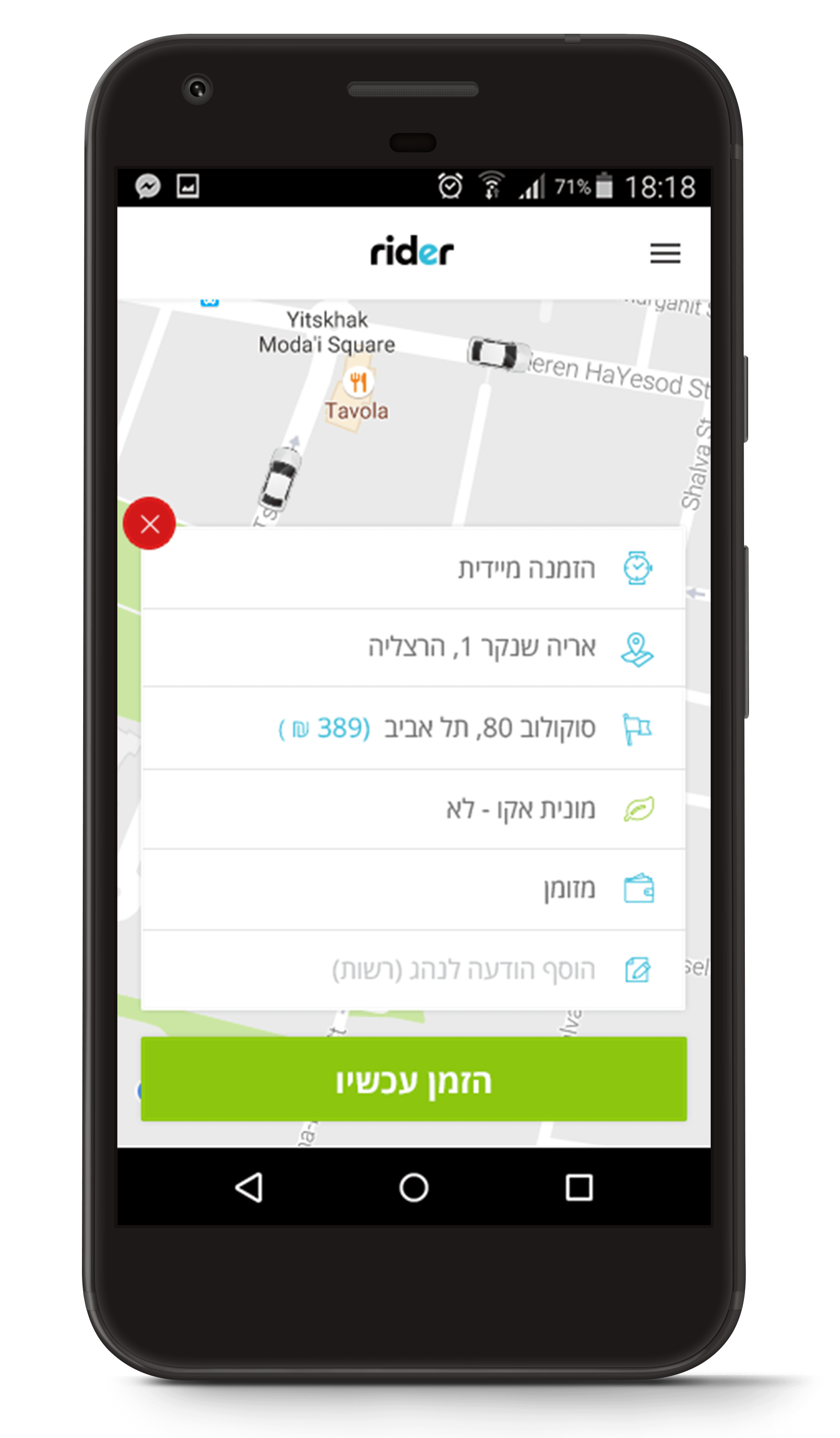
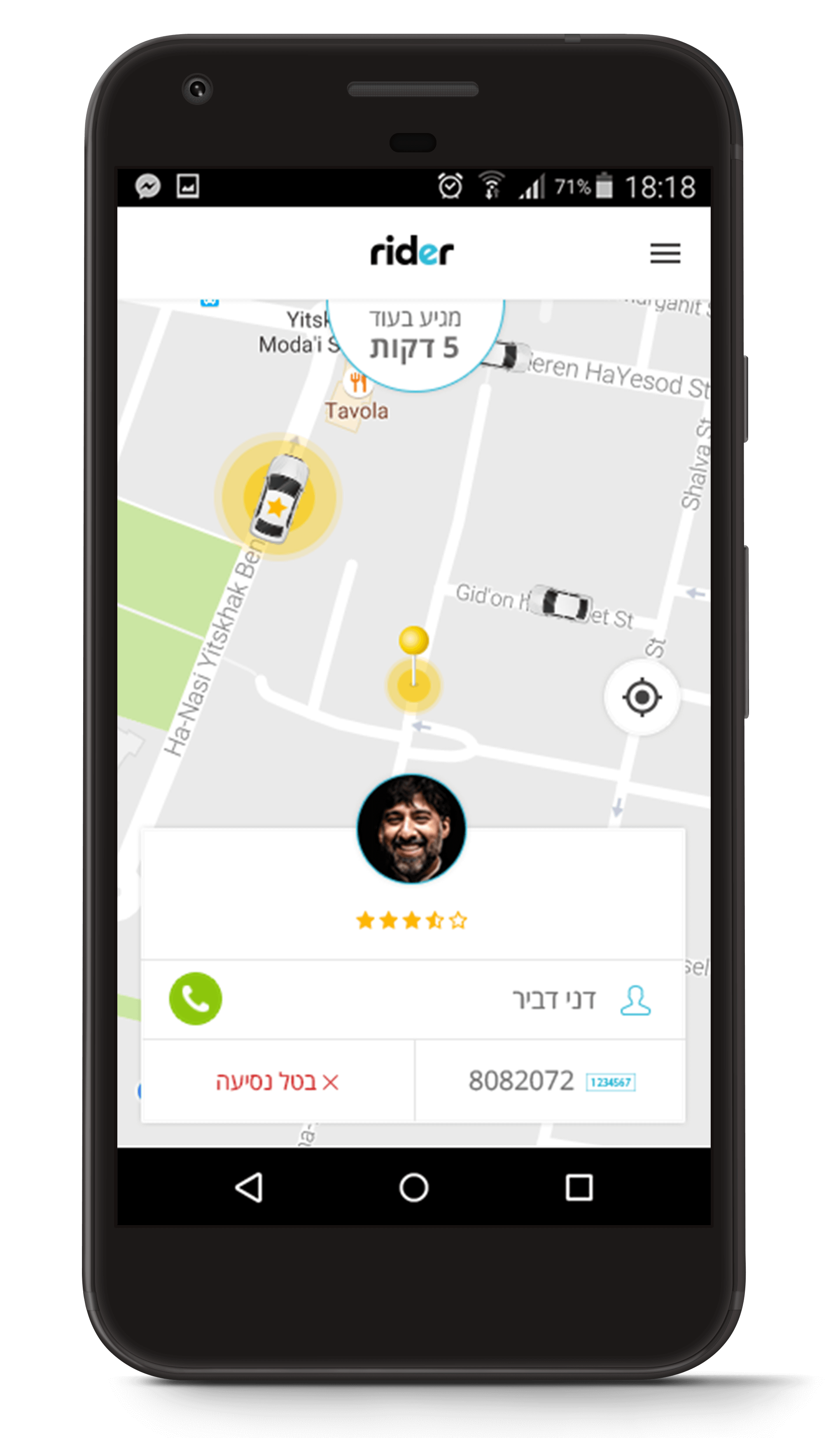
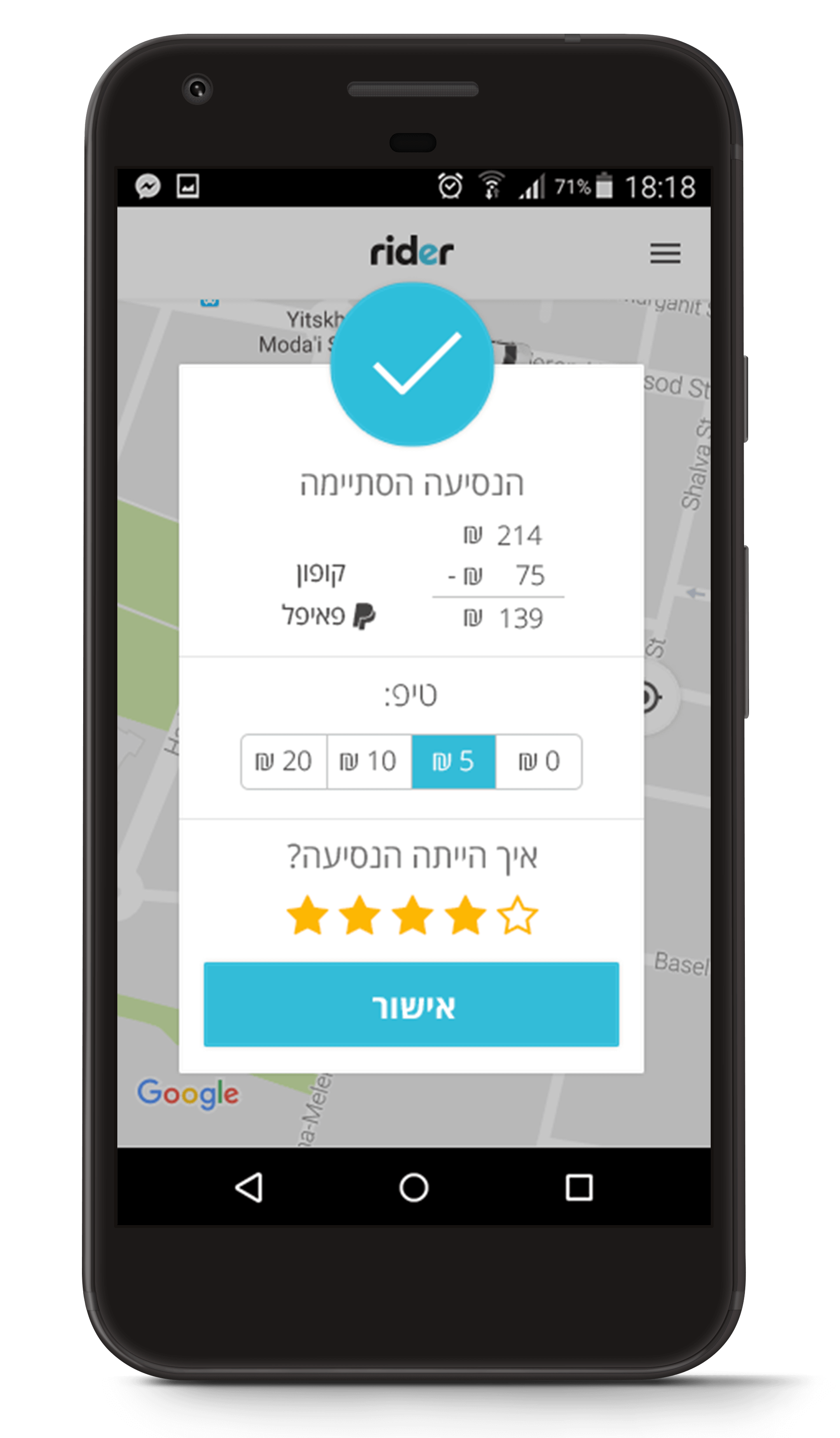
After doing a (very short) research on the market and problems users encountered with the previous version, we decided on the list of things that, if fixed, would have the biggest impact in the short ammount of time we had. On the passenger version, we focused on the map screen - making it clearer, ordering a ride and checking the ride history. On the driver version, we focused on the sign up process - making it faster, the screens during a ride and checking out payments. For both versions, we've also reorganized the IA and user flows. The new features included things like asking for a "green" ride and getting discounts.
Visual
On the visual side, we kept the original logo and colors but updated the general styling, icons, fonts and layout to make the UI more consistent, clean and modern. The design was approved on the first round, which allowed us a little more time for fine tuning and some QA.