Ushare
Ushare were a small startup - 2 friends with an idea in the real estate world - a world one of them, being a broker, knows very well.
The problem
The problem was this: whenever 2 real estate brokers want to cooperate, they should, ideally, sign a contract - but they rarely do. Printing, signing, scanning and sending Word documents is not the most conveniet thing, and it becomes a real problem when you need to sign about 20 of those while showing an apartment. The brokers never sign the contracts, which often leads to misunderstandings and/or legal issues.
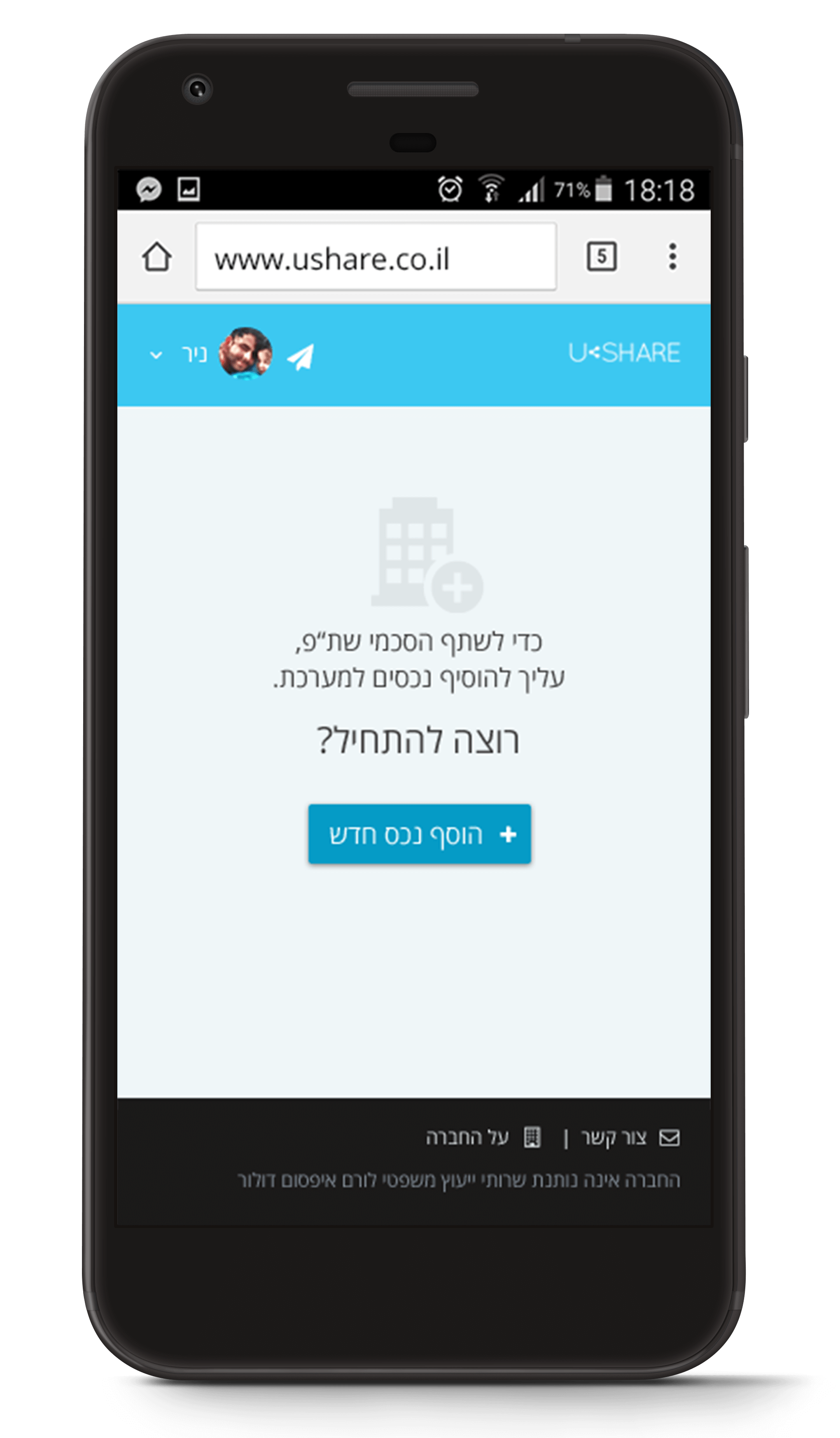
The solution was simple - signing on the go and creating the contract with a mobile app. The contracts are, overall, very similar to one another, so a simple template could be used and the brokers would also have an easy way to find new opportunities as well as access, manage and publish all their assets from one place.
Ship, learn, repeat
Since Ushare were in a very early stage, our first task was to help define the MVP - what's the core functionality that has to be built right away and what's a "nice to have" that can wait until a later stage. The full platform Ushare guys had in mind was quite big, and we suggested focusing only on the first, most important feature that was the essence of their app - creating and signing contracts on the go. Once we could show this is indeed something people would want to use, they could build upon the initial version.
After some research, an interview and a couple of brainstorming sessions, we helped identify the questions that needed answers and decided on few most common use cases:
In what situations would the broker create the contract? Would it be from his office? In a cab on the way to an apartment showing? In the apartment itself?
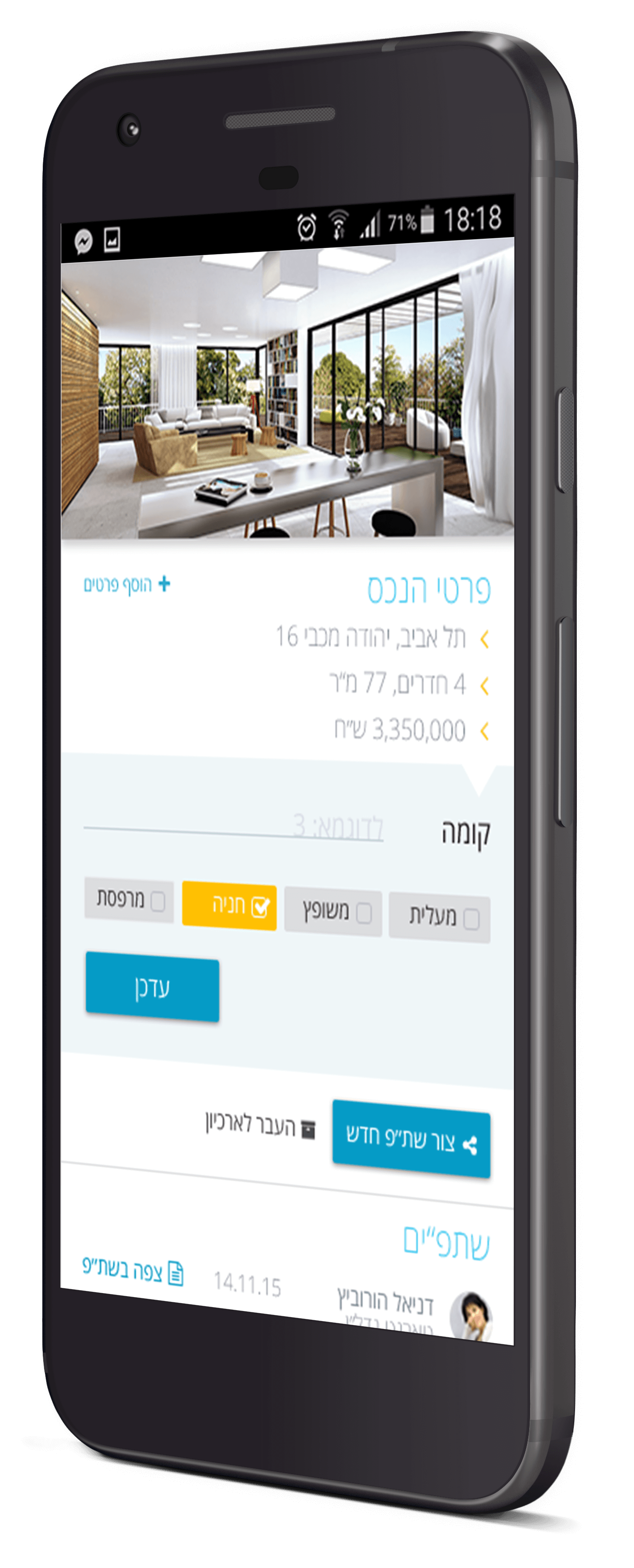
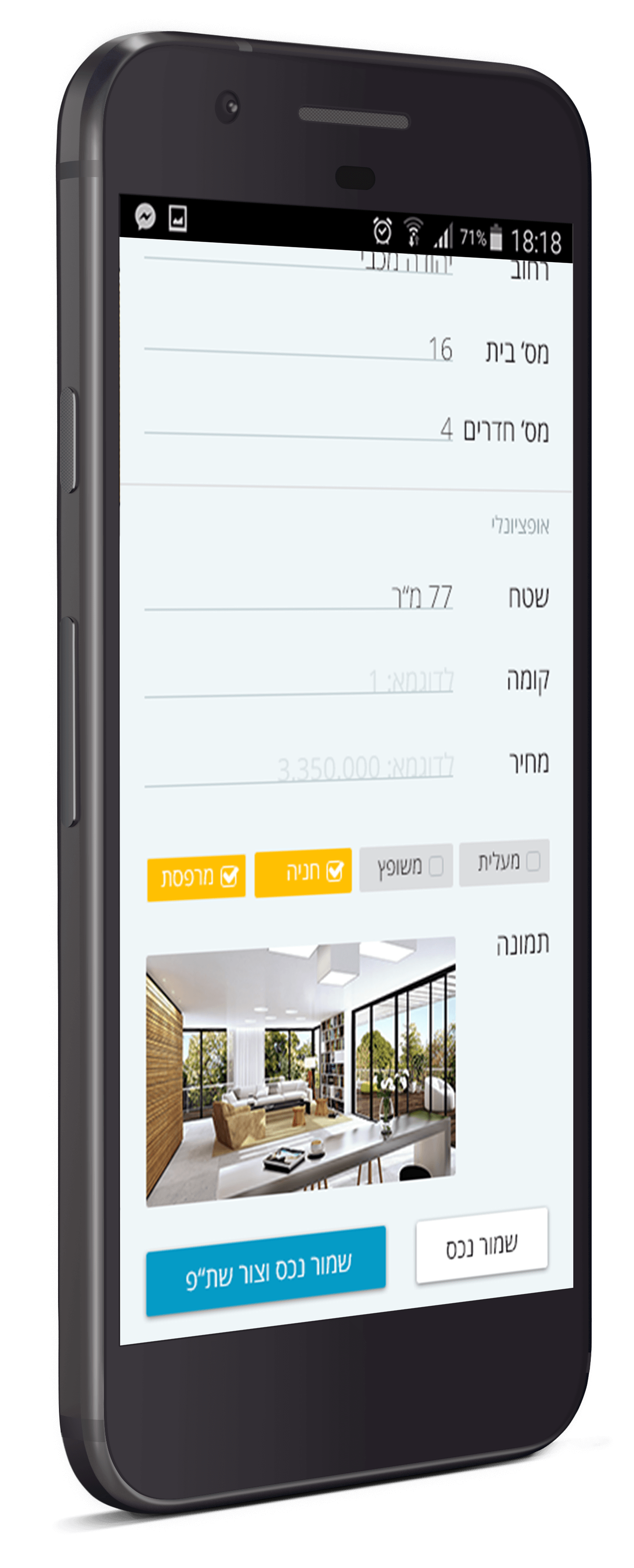
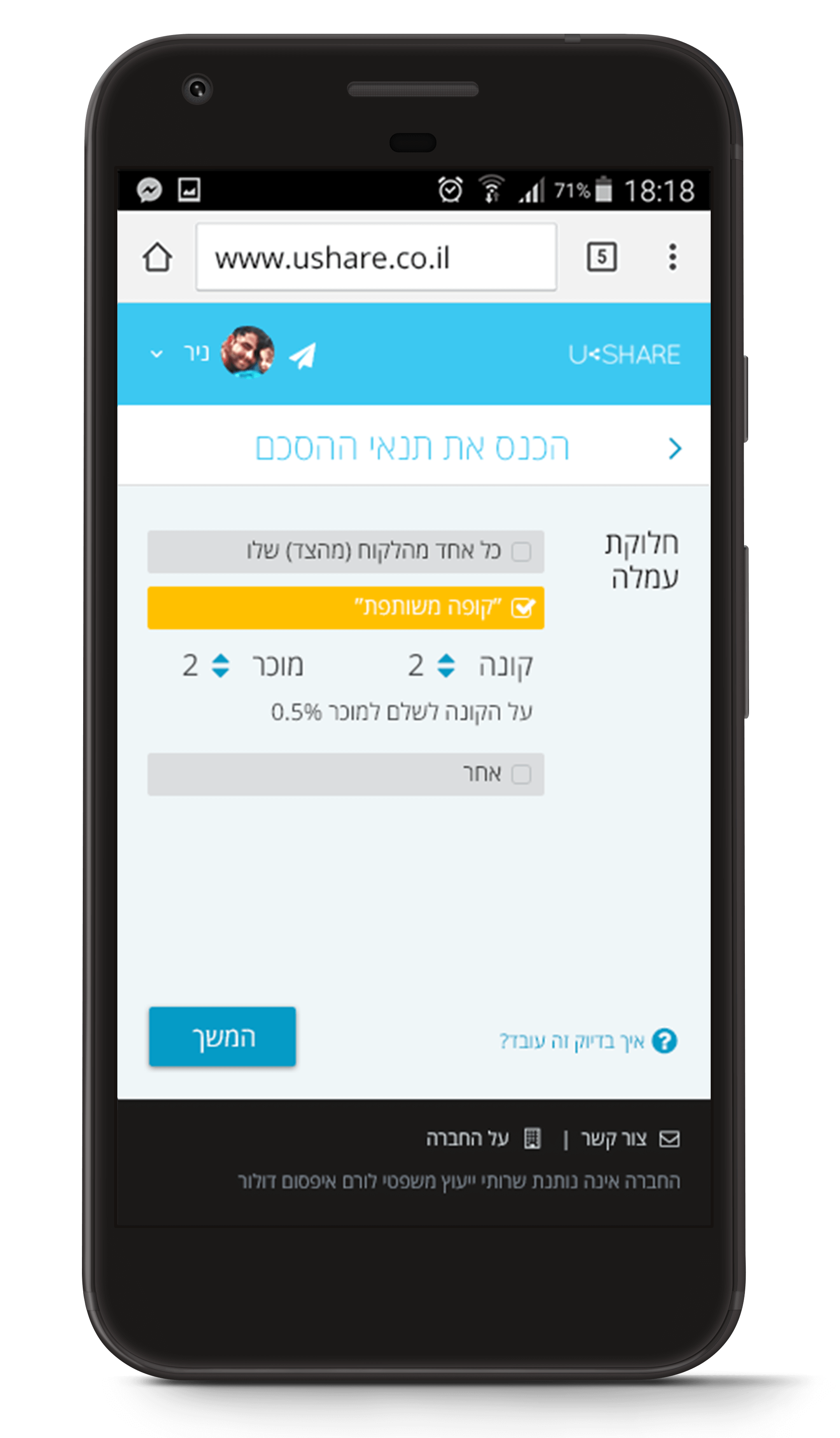
What data is a must have to identify a property? An address? Number of rooms? Price? Pictures?
What are the differences between one contract to another?
When would the broker need to share/sign the contracts?
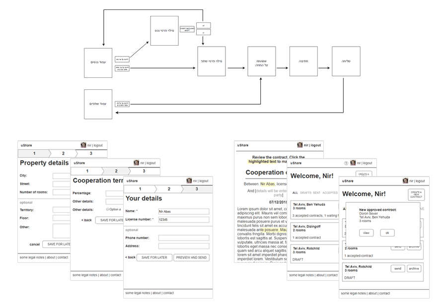
Once we had the relevant information, we could create user flows and wireframes for the screens needed.
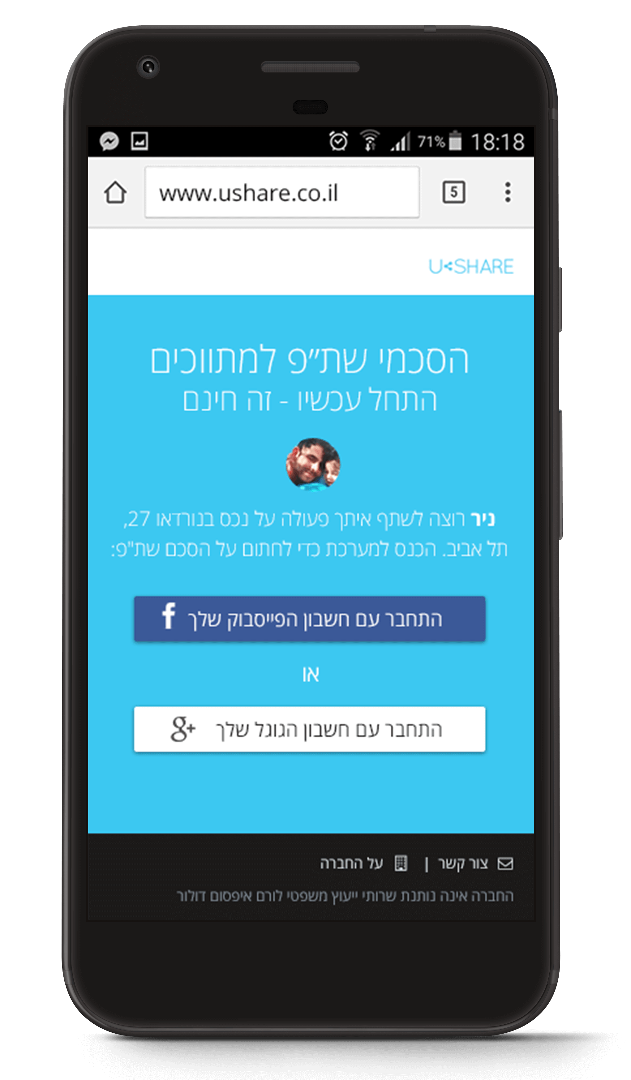
We allowed sign up with Google/Facebook to make the process faster, and only asked for one other piece of information - the license number. We decided to use a wizard type form to enter the data for each asset/contract template. Any details that weren't a must, the user could add later on, from the convenience of his or her office; but the initial contract could be created in no time at all, and accepting the contract on the recieving side wouldn't require anything but a dead simple sign up and a quick signature.
Due to the nature of the product, it was also decided to focus first on developing and getting out just the mobile app, with no regard to the web version, and build the app in Hebrew for the local audience.
In the design phase, we created for Ushare a simple logo and a color pallete in a "instant branding" process. The design style was clean and minimalistic, and used Font Awesome icons to help finish the development as quickly as possible and to make the app look proffesional, clear, inviting and easy to use.
In the last stage, we built a few mockups on Invision to test a few things before moving on to development. The tests we created/suggested were run by Ushare themselves and helped with some of the questions we had about the UI at that point.